Gaming and entertainment are visual industries, but many of their most important decisions still happen through text. A player reads a menu, compares editions, checks a review score, scans subtitles, follows a quest prompt, or decides whether a game store page feels worth trusting. Typography shapes all of those moments.
For publishers, studios, streaming platforms, entertainment blogs, and fan communities, fonts are becoming part of the experience. A clear type system can make a review easier to scan, a game interface easier to navigate, and a brand easier to remember. Poor typography can make even strong content feel harder to use.
This trend fits the way audiences now move between games, films, comics, tech, podcasts, and online fandom. A site or brand may need to look energetic without becoming unreadable. That balance is where typography matters.
Why readable typography matters for entertainment audiences
Entertainment readers and players rarely interact with content in one calm setting. They may read reviews on mobile, watch a trailer with subtitles, compare specs before buying hardware, or browse guides while playing. The type needs to support speed, emotion, and clarity at the same time.
· make game reviews easier to scan;
· keep subtitles and captions comfortable to read;
· clarify prices, editions, release dates, and platform details;
· make UI labels and menus easier to navigate;
· help entertainment brands feel consistent across web, video, social, and apps.
| Content Area | Typography Challenge | Better Design Response |
| Game review | Readers compare verdict, platform, pros, and cons | Clear headings, readable body text, and strong score presentation |
| Game UI | Players need fast decisions under pressure | Legible labels, clear icons, and reliable numerals |
| Streaming or video content | Subtitles must be readable across scenes | High contrast, proper spacing, and simple letterforms |
| Entertainment news | Readers skim names, dates, releases, and quotes | Short paragraphs and clear hierarchy |
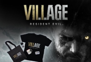
| Merch or fan campaign | Brand energy must stay recognizable | Distinctive display type supported by readable text |
Style should not defeat usability
Gaming and geek culture often embrace bold visual identities: neon cyberpunk menus, fantasy lettering, comic-style titles, horror textures, retro arcade references, and futuristic UI panels. These styles can be memorable, but they should not carry every piece of information.
| Expressive Typography | Usability-Focused Typography |
| Works well for logos, posters, trailers, and hero graphics | Works well for menus, subtitles, reviews, guides, and settings |
| Creates mood and genre identity | Supports fast reading and decision-making |
| Can be decorative or distorted | Keeps letters and numbers easy to distinguish |
| Best in short bursts | Reliable for repeated reading |
A horror game can use distressed lettering in a title screen, but its save menu and accessibility settings should still be readable. A superhero review page can have a bold headline style, but the article body needs comfort over personality.
Commercial and custom fonts both have a role
Not every game site, YouTube channel, indie studio, or entertainment brand needs a custom typeface. Many can build a strong identity with a professional commercial family. Custom typography becomes more useful when a brand expands across websites, apps, games, videos, packaging, merchandise, and live events.
| Font Option | Best For | Main Risk |
| Free fonts | Early fan projects, prototypes, and personal content | Overuse or unclear commercial permissions |
| Commercial fonts | Professional websites, campaigns, apps, and editorial brands | Requires budget and license tracking |
| Variable fonts | Responsive sites, game hubs, and flexible UI systems | Needs careful implementation |
| Custom fonts | Studios, publishers, platforms, and large entertainment franchises | Higher cost and longer timeline |
Entertainment teams comparing professional font families, variable fonts, or custom typography options can review foundries such as TypeType when they need type systems that can be tested across websites, apps, dashboards, title screens, campaigns, and brand materials.
Font licensing belongs in the production pipeline
Font licensing is easy to overlook because fonts feel like creative assets. Legally, fonts are software. A license defines where and how they may be used. An entertainment brand might use the same typeface on a website, game UI, trailer, subtitle system, poster, merchandise, mobile app, or downloadable press kit.
| Use Case | Licensing Question |
| Website | Can the font be embedded as a webfont? |
| Game or app UI | Does the license allow software embedding? |
| Trailer or video | Are motion and campaign uses covered? |
| Poster or key art | Is commercial promotional use allowed? |
| Merchandise | Can the font appear on products for sale? |
| Press kit or PDF | Can the font be embedded in downloadable files? |
| Contractors | Can font files be shared with freelancers or agencies? |
Common typography mistakes in gaming and entertainment content
Most typography problems appear when a design is judged only by mood. Real users deal with small screens, fast movement, subtitles, long reviews, store pages, menus, and accessibility settings.
· using decorative fonts for body text or subtitles;
· making mobile review pages too dense;
· choosing unclear numerals for prices, scores, release dates, or damage stats;
· mixing too many typefaces in one campaign;
· placing low-contrast text over dramatic artwork;
· forgetting multilingual characters for global audiences;
· using a personal-use font in a commercial game, video, or merchandise project;
· treating licensing as a final legal check.
| Better Choice | Why It Helps |
| Readable body font | Supports reviews, guides, and news articles |
| Clear numerals | Reduces confusion in scores, prices, stats, and dates |
| Distinct display style | Creates genre identity without hurting long reading |
| Consistent captions | Makes video and image-led content feel more polished |
| Documented license | Reduces risk before release or campaign launch |
What this means for studios, publishers, and fan media
| Team or Brand | Typography Can Support |
| Game studio | Menus, HUDs, trailers, store pages, and patch notes |
| Entertainment site | Reviews, news, interviews, and comparison articles |
| Streaming creator | Thumbnails, captions, overlays, and merch |
| Publisher | Brand consistency across campaigns and platforms |
| Comic or pop-culture brand | Expressive identity with readable storytelling |
| Tech or hardware reviewer | Specs, comparisons, captions, and buying guides |
The encouraging part is that better typography does not always require a huge rebrand. A simple system with a readable body font, a strong display style, clear numerals, and documented licenses can already improve how a brand communicates.
Last Updated: August 14, 2026