As far as iconography goes, Nintendo has a visual identity that is simple, timeless and iconic in a day and age where one graphic designer can make a fortune just for slightly changing the font for Google. I’m…I’m in the wrong industry I think. Anyway, Nintendo’s logo is one of history and simplicity. While the font of choice was chosen way back for the 1967 logo, the oval encapsulation of the company’s name began in 1970 and has remained the same ever since then.
It’s the Coca Cola of video game logos, an eternal symbol that is simple but striking. It’s also a brand that armchair critics lean on to say that Nintendo only makes “kiddie” games and the reason why only children and man-babies play on that system instead of going outside and doing gnarly 900 skateboard flips over a row of Ferraris. I think. Real gamers play on PlayStation and take your mom out to a fancy restaurant because she’s a wonderful lady who deserves to be spoiled but noooooo her son is at home playing Super Rosario and The Legend of Link.
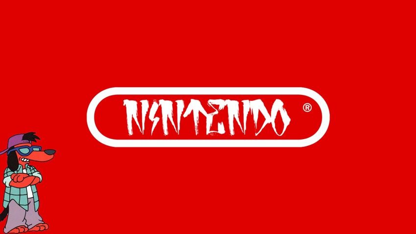
In an age where gaming was getting pretty extreme, Nintendo’s marketing team over in the US of A were to make the company logo more radical dude, so that they could shed their kiddie game moniker. Plans and prototypes were made, and Nintendo almost underwent a cosmetic brand change until big daddy Reggie Fils-Aime stepped in to kick those plans square in the Deku nuts.
“From a branding standpoint, we had to be clear in what Nintendo as a brand stood for, as well as what the individual franchises stood for,” the former Nintendo big cheese said on the Present Value podcast (Cheers Reddit).
I’ll give you an example. When I joined Nintendo, there was a sense of almost shame that Nintendo appealed to young consumers, and the marketing team at Nintendo of America started doing things with the logo – that classic Nintendo logo in an oval – they would put it into graffiti style, or they’d do different things to try and age up the logo, and I put a stop to that because that is not our brand. And what we needed to do was yes, appeal to a broad swatch of consumers, but we needed to do it based on what the brand stood for, and not doing it in some false way.
Systemically, we went through and cleaned up the presentation of the brand, but we also created messaging coupled with content that really broadened the reach, broadened the appeal, and set the stage for all of the great products we would launch like Wii, like Wii Fit, and eventually the Nintendo Switch.
Since then, Nintendo has stayed Nintendo and still uses the same logo to this day. I can’t think of anything else to end this post on, so if you’re pedantic I’m going to ruin your day and remind you that the Nintendo Switch logo isn’t entirely symmetrical in its design. Happy Monday!
Last Updated: January 27, 2020


Hammersteyn
January 27, 2020 at 09:16
hehe poochie