We live in the age of mass-media conglomerations, where every small studio is getting bought out by a big media behemoth as they try to bolster their original content to lure in subscribers to new streaming services. One of the recent big deals has been the merger of the AT&T-owned WarnerMedia with Discovery Inc. to create one single media company which is expected to be valued at $150 billion. Besides being co-run/owned by shareholders and execs from both AT&T (70% stocks) and Discovery, this merger will combine the various Warner Bros. media properties with Discovery Inc.’s, such as TLC, Food Network, HGTV, Animal Planet, Discovery Channel and the Oprah Winfrey Network, and Discovery’s own streaming service Discovery+ with HBO Max.
Like all new companies, this merger needs a new name and logo which doesn’t look incredibly dated. Unfortunately, nobody involved here appears to have got that memo.
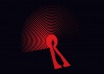
The newly formed Warner Bros. Discovery is perhaps a silly name, but it’s not altogether unexpected given the popularity of both existing brands. It is the logo design and slogan though that just looks incredibly dated and makes you wonder what AT&T and co are trying to convey with it. Is this company supposed to herald the future of entertainment or be a home for classic content? Because I am definitely getting the latter from its message!
David Zaslav, Discovery’s chief executive and the new company’s expected CEO had the following to say of the announcement:
Warner Bros. Discovery will aspire to be the most innovative, exciting and fun place to tell stories in the world – that is what the company will be about. We love the new company’s name because it represents the combination of Warner Bros.’ fabled hundred year legacy of creative, authentic storytelling and taking bold risks to bring the most amazing stories to life, with Discovery’s global brand that has always stood brightly for integrity, innovation and inspiration.
The amount of content now owned by the company should easily allow them to offer a wide range of content on HBO Max that would rival most other streaming platforms. Let’s hope they can deliver more excitement through all their new content than what that new logo suggests.
Last Updated: June 2, 2021


Frik van der Hewerskink
June 2, 2021 at 07:13
I personally like it a lot. So many logos are getting the flat smack. Look at how they butchered the Pringels logo. Everyone is just opting for flat design, no one is taking risks anymore.
Gr8_Balls_o_Fire
June 3, 2021 at 03:06
I like it. It now stands out from the crowd.